Updates
A beautiful, more refined user interface redesign
Ok, so maybe it doesn’t look that different, but we did rewrite Orologe from the ground up. Getting away from the now deprecated Quartz Composer View, we rewrote Orologe in Swift with Swift UI. The codebase, not that you can see it, is much cleaner, easier and more fun to work with. Again, a detail you might not be interested in. But it makes us happy.
More fonts
We’ve made more fonts available for you to use. We’ve added more font families, and labored over the text presentation. These classic fonts are wonderful seen in large sizes, and Orologe gives you a change to see what their beautifully designed numerals look like. We’re really excited for you to explore these great fonts as you use Orologe everyday.
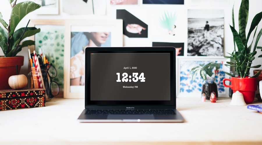
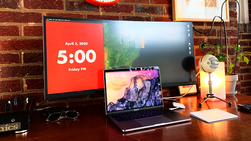
More colors
In addition to black and white, we added 63 classic colors that go wonderfully together. These colors allow you to style Orologe to match the environment you’re adding it to. We can’t wait to see your favorite combinations.